[ Retro Scan of the Week ] Double Dungeons
February 23rd, 2009 by Benj Edwards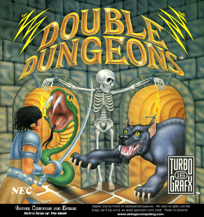 Now we know where those sword-shaped cocktail spears came from.
I seem to recall a 1UP.com feature a few years back that named this colorful airbrush illustration from Double Dungeons (TurboGrafx-16, 1990) as some of the worst cover art of all time. I’d have to disagree. While kinda cheesy by modern standards, I found it captivating when I was a kid. It made me want to play the game, which is probably the goal, right?
Discussion topic of the week: Share your nominations for the best and worst video game cover art of all time.
If you use this image on your site, please support “Retro Scan of the Week” by giving us obvious credit for the original scan and entry. Thanks.


February 23rd, 2009 at 6:53 pm
Hands-down, the worst cover art for a video game is Megaman 1. Megaman 2 is a close second, but at least it was a higher-quality illustration than the mess on the cover of the first one. The only thing that redeems it is the artwork for Megaman 9, painted intentionally cheesy and misleading as a nod to this infamous cover.
As for best, that’s harder to say. I can’t really decide, so I’ll just go with one of my favorites – Final Fantasy VII. The shot of Cloud looking up at Midgar is classic, and sets the tone for the game. Yeah, I’m a fanboy, but I can live with it.
February 23rd, 2009 at 10:09 pm
Yeah, I’m afraid I can’t think of any cover art worse (or maybe just bizarrely inaccurate) than the original NES Mega Man.
February 24th, 2009 at 10:20 pm
Third in for Megaman. I remember looking at his face and thinking it was about an ape or monkey.
This is followed closely by every cover art sham made for Apple][E I played as a child.
February 25th, 2009 at 1:09 pm
I’d have to say Iron Sword: Wizards and Warriors II on the NES. When I found out it was Fabio on the cover It just didn’t feel right owning the cart. I’d take bad Mega Man art over Fabio any day. Basically any cover without real artwork. The cover for (and game for that matter) “Plumbers Don’t Wear Ties” on the 3D0 is also horrible. It mentions Chicken, shower scenes, race cars, and Pandas randomly as a ploy to get an unsuspecting gamer curious enough to play it.
February 25th, 2009 at 1:13 pm
As for favorite cpover I’ll go for Demon Attack for the Atari 2600. You can’t go wrong with chrome dinosaurs flying through sace with missiles strapped to their back.
March 1st, 2009 at 3:54 pm
I love a lot of Atari’s 2600 box art that seemed to be reminiscent of movie posters… Night Driver, Missile Command… really rich, textured, skilled artwork.
Later on as a teen I absolutely loved the minimalist, sophisticated, consistent style of the first few years of Sega Master System box art (in the West). But in retrospect, I think it was a miscalculation for them to think that that style would have mass appeal for kids and teens. I still love it though… the silver grid, the formal font, and the iconographic image in the bottom left corner… pure class.
Current box art doesn’t seem as impactful to me, maybe because it’s just so similar to any other advertising/DVD artwork.