VC&G Review: Areaware Windows Solitaire Cards
August 26th, 2016 by Benj Edwards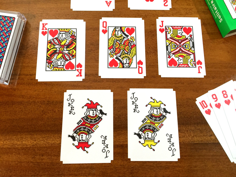
No, you’re not seeing things. These are actual physical playing cards designed to look just like the classic Microsoft Solitaire card faces — the same faces Microsoft used for its Windows-based card games between 1990 and 2007.
Just this month, home decor vendor Areaware began selling the cards, which were produced with the help of the cards’ original graphic designer, Susan Kare (and with the blessings/license of Microsoft).
Kare is best known as the designer of the original Macintosh fonts, icons, and interface elements. She also created most of the icons for Windows 3.0, which was the first version of Windows to ship with Microsoft Solitaire. Along the way, she ended up designing the Solitaire cards too.
Excited as I always am for computer nostalgia, I eagerly bought a pack of these new cards as soon as they became available, and I put them through the ultimate test: a game of real desktop Klondike solitaire.
Manufacturing Quality
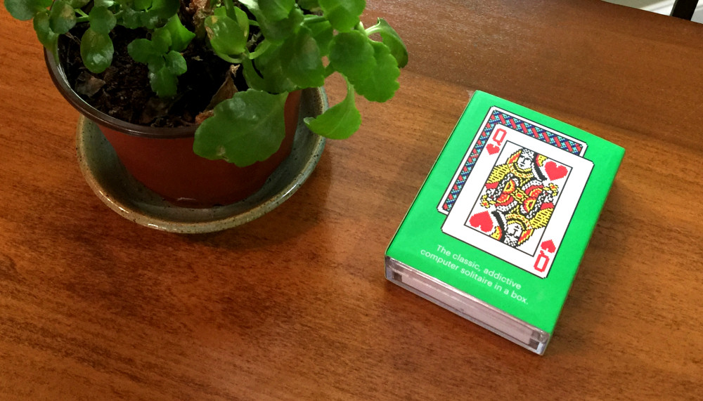 Areaware’s Solitaire Cards, which currently sell for US $14 a pack, come nicely packaged in a clear plastic reusable case with a cardboard slip cover. The deck arrives crisp and clean within, neatly wrapped in cellophane.
Physically, the cards feel well-made, about the same quality you’d expect from a $3 pack of Bicycle poker cards. Each Areaware card is coated and feels about as thick as a normal playing card. You get 54 cards in total — all the cards of the four Western playing card suits plus two joker cards that Susan Kare designed especially for this set (see photo above). The new joker design fits well with the vintage card theme.
Regarding the card’s coating, they are perhaps a little too slick, because they very easily slide all over the place when you try to set them on top of each other. It’s the kind of thing you do frequently when you, well, play a game of solitaire.
Card Design
 Aside from the new joker card design I mentioned above, the 52 other cards in the deck take their designs almost directly from Windows 3.0 Solitaire card faces. The card back design is also from the original Windows game.
Each of the cards has a square notch cut out of all four corners to add a pixelated motif. It’s a nice touch, but the notches can catch on other cards and get in the way a bit if you’re handling cards quickly. That being said, the notches are not a big problem.
Curious to see how accurately the Windows designs were reflected in the print cards, I scanned and compared several of the face cards. I discovered many subtle differences — none of them major enough to get in the way of the enjoyment of using the card deck. But still it is worth nothing that the cards are not 100% authentic facsimiles of Microsoft Solitaire card designs.
Here is a good example: the king of hearts card. All of the major design elements are there, and the corner suit markers have been re-positioned to better fit the card. If you directly overlay the two cards, you can see a few different pixel colors here and there. Aside from the removed magenta anti-aliasing, you have to be eagle-eyed to spot the differences (take a look at this GIF which alternates between the two cards).
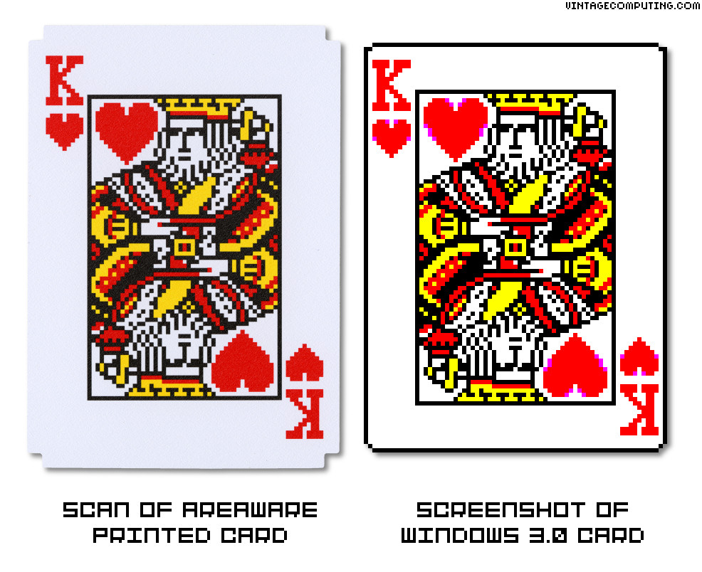
The king of clubs card has even more changes, many of which I’d say were unnecessary. But again, if you didn’t sit down and study the differences like I did, you probably wouldn’t notice.
As you can tell, I am a huge Windows Solitaire nerd — perhaps the only person who might bother with such a comparison. But then again, this Microsoft card game is probably one of the most (if not the most) played computer games of all time, so the subject is not entirely trivial.
I have been in touch with Susan Kare over the years, so just today I sent her an email asking about the design differences. Were they mistakes? Here’s what she said:
“We had slightly to adjust the aspect ratio for the printed cards. I also had to make vector versions of each card and it’s possible that I inadvertently changed a pixel or two in the KJQ cards; nothing intentional. It was a chance to look over everything and aim for consistency. I made the jokers new for Areaware. (I worked with Lisa Smith at Areaware — she was great.)” — Susan Kare
After looking a little more closely at the comparison I sent her, she also said, “I see where I missed one pixel but made decisions to remove another and make the hearts all red.”
Again, this is just minutia, really. Kare is the designer, and if anyone can modify the design and get away with it, it’s her. She did a great job optimizing the cards for a print run.
Playing Solitaire
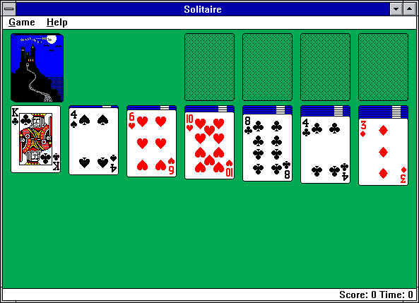
So how to the cards play? Well, when you lay them all out in a Klondike pattern, they look like this:
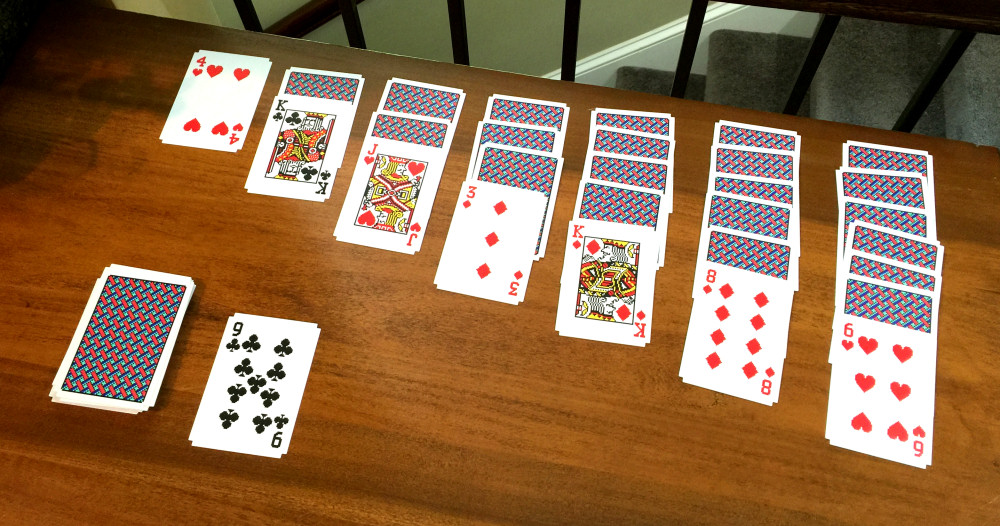
It’s enough to make yer teeny Windows-lovin’ heart go pitter-patter.
But I’m not going to lie: I had no idea how to set them up at first. Although I have played Klondike solitaire thousands of times on a computer, I had only played it with real cards once or twice, so I had to look up how to arrange the cards on Wikipedia. It would be nice if it came with printed instructions on how to play — or at least set up — Klondike solitaire.
Once it was set up, though, I had no trouble playing. It was quite fun until I got into an unwinnable situation. I was tempted to cheat because, unlike on the computer, the cards were sitting right in front of me (and no one was watching), but I didn’t. After a re-shuffle, I played another game that I promptly won.
And just like in the Windows version, the cards started flying everywhere, bouncing all over the room.
Ok, I’m kidding: I just threw them up in the air and laughed like a crazed Solitaire fan. It’s been a good day.
Q&A With Susan Kare, Designer of Microsoft Solitaire Cards (from 2008)
VC&G: How did you end up being the designer of the Windows Solitaire cards?
Susan Kare: It was part of the Windows 3.0 contract
VC&G: Was any particular card more challenging to draw than another?
SK: Kind of obvious, but the K, Q, J were the most complex.
VC&G: Do you have a favorite card design from the bunch?
SK: Not really
VC&G: Did you model your cards off of any particular brand of real playing cards?
SK: No
VC&G: What method did you use to design the cards?
SK: Studio 8 (from Electronic Arts) and the paint program that came with Windows — 16 VGA colors
VC&G: While designing the cards, how much did you interact with Wes Cherry, programmer of Solitaire?
SK: Not at all.
VC&G: To your knowledge, have the Windows Solitaire card face graphics remained unmodified from your original Windows 3.0 version until XP?
SK: Believe so
VC&G: When’s the last time you played Windows Solitaire with your card designs in it? Did you enjoy it?
SK: I love Solitaire. I mostly play on my phone now though.
| The Skinny: Areaware Windows Solitaire Cards | |
| Good Features: | Clever idea taps into nostalgia, high quality card material, good quality printing, Susan Kare involvement |
| Bad Features: | Not 100% accurate to Windows card faces, corners and slickness make handling more difficult, slightly expensive, no solitaire instructions included |
| VC Rating: (10 Being Best) |
[ 8 out of 10 ] Shiny Marbles – Excellent |


August 26th, 2016 at 5:01 pm
This is a great idea!
At first I wondered if you were republishing an April Fool’s Day prank. I had to check the date to be sure!
August 29th, 2016 at 9:28 am
Thanks for the review! At $19 (including shipping) they are pretty pricy, but did add it to my Christmas ideas list for my brother. He’ll be getting these with a PS/2 mouse that I plan to convert into USB.
It’s nice of Ms. Kare to talk with you about these, but I don’t believe her explanation of the changes “for consistency.†Not that it really matters I guess.
Love your review!